Here at Seccl, our visual identity has remained largely unchanged since 2018. Back then, we were home to just nine talented people – including our founders Dave and Hugo – and, having not yet gone to market, we safeguarded a big round £zero of client assets.
It’s fair to say we’ve grown a bit since then. Today…
-
We’re home to over 100 of the most passionate and principled people in financial services and technology
-
129,000 investors rely on our software and services
-
We regularly see more than 1.5 million daily requests to our API
-
We’re the fastest-growing platform technology provider in the market, with 307% year-on-year growth in monthly net flows at the end of 2022
-
We’re proudly part of Octopus, the £12.5 billion group that’s on a mission to breathe new life into broken industries, through companies like Octopus Energy, Octopus Investments and Octopus Ventures
In other words, we’re no longer a start-up. We’re a rapidly growing scale-up with big ambitions and a strong, well-aligned backer to help bring them to life.
We felt it was about time, then, that we create a new identity to arm us for our new stage of growth; one that could…
-
Reflect our alignment with Octopus, the disruptive, purpose-filled group of companies that we’re proud to call family
-
Reinforce our positioning as the embedded investment platform: a business that’s transforming the way our sector operates for the better
-
Help us stand out brightly in a monochrome market, with a warm and confident personality that speaks to our purpose
Obviously Octopus
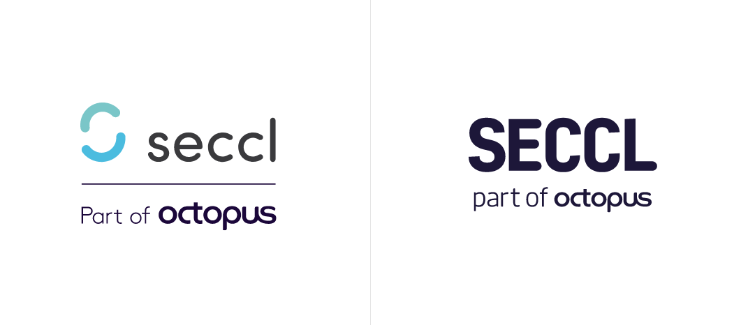
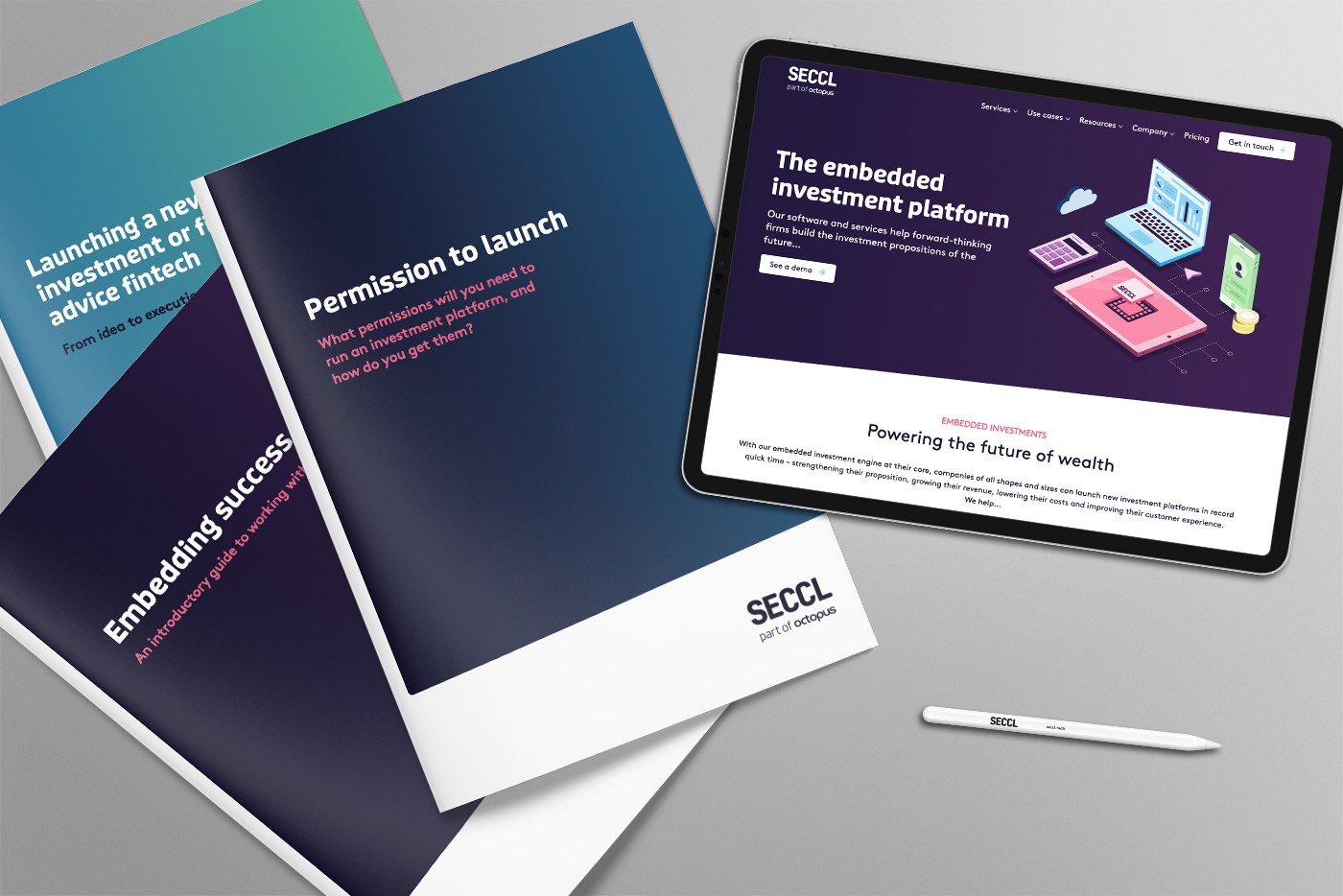
Our new identity waves goodbye to our soft curves and teal tones, and throws us fully into Octopus’s garden, with a new logotype, colour palette and typography.
Our colour palette and typography borrow from the Octopus brand suite. We now share their characteristic dark blue, purple and pink, and use a set of typefaces that bring the seriousness our sector expects, but with the trademark personality and approachability that sets all Octopus businesses apart.
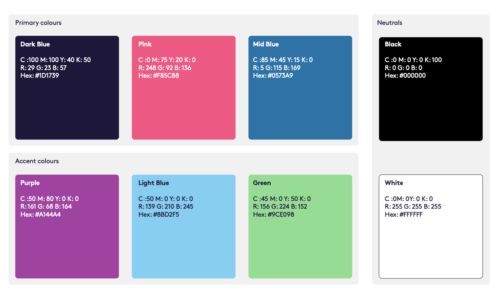
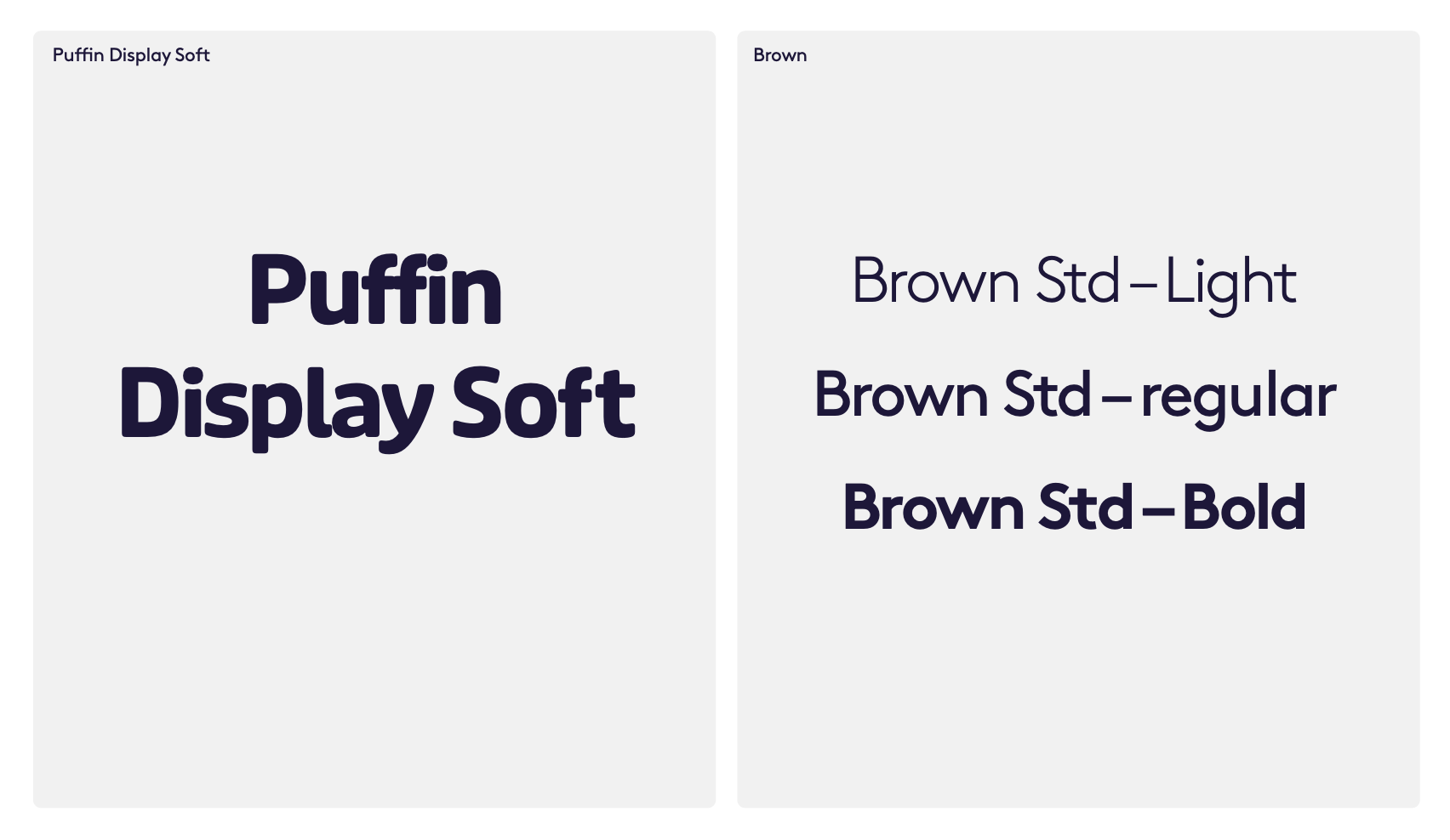
This balance of gravity and levity is something we’ve tried hard to get right. Octopus talks a lot about combining the ‘head’ and the ‘heart’ – the rational and the emotional – and it’s a theme that resonates particularly strongly with us.
We want millions of people to trust us to safeguard their money. It’s a massive responsibility that demands a rigorous, robust approach. But we’re also convinced that our market is too often cold, faceless and impersonal; held back by outdated corporates with misaligned interests.
In other words, we wanted our identity to show that we have the disruptive mindset and ambitious mission to shake things up, as well as the commitment and substance to not screw them up.
As for the logo, we wanted to create something that could better sit alongside the Octopus identity. With that in mind, we set about creating a wholly new logotype, intentionally designed to exist in the context of the Octopus brand.
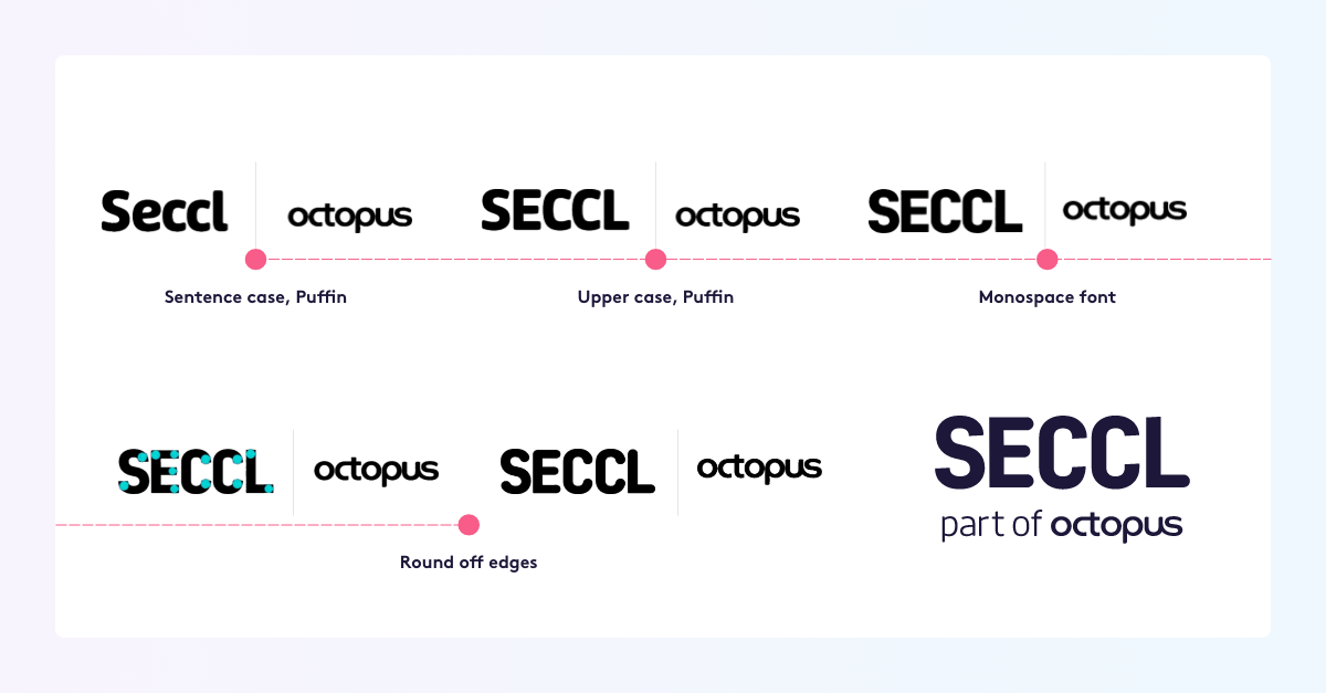
Here, too, we tried to combine the strength of a bold, uppercase, monospace font, with the softness and approachability of the Octopus logo (and our previous one, too).
To incorporate additional ‘edge’ – and hint at our forward progress and momentum – we have also introduced a new, Octopus Ventures-inspired 3-degree angle, a device used not only in our logo but throughout our whole identity.
Our purpose and positioning
Our new identity is designed to reflect and reinforce our purpose and positioning. At the most fundamental level, we exist to help more people to invest — and invest well.

And our technology makes it possible. With our software and services at their core, companies of all shapes, sizes and stages of growth can quickly and affordably launch the investment platforms of the future.
We’re the embedded investment platform. We’re here to make a massive and positive impact, not just on our sector, but on the financial lives of millions of people. We mean business. And now, hopefully we look the part, too…
What do you make of our new identity? Get in touch and let us know what you think!
